A brand equal to 22 years of method. Uma marca à altura de 22 anos de método.
Mental Clean is a strategic consultancy for mental health in companies, with its own methodology built on the Body, Mind and Soul triad.A Mental Clean é uma consultoria estratégica de saúde mental nas empresas, com metodologia própria construída sobre a tríade Corpo, Mente e Alma.
- ClientCliente
- Mental Clean
- ProjectProjeto
- Rebranding
- YearAno
- 2026
- DeliveryEntrega
- Symbol, logo, brand platform, verbal identity, brand guide and rolloutSímbolo, logo, plataforma de marca, identidade verbal, brandguide e desdobramentos
O desafioThe challenge
A Mental Clean trabalha há 22 anos com saúde mental nas empresas, muito antes de a NR-01 passar a incluir os riscos psicossociais. A marca não mostrava essa maturidade. Portais, políticas e programas tinham aparências diferentes entre si, e nada dizia a quem decide em RH, ASG e Segurança do Trabalho que ali havia uma consultoria estratégica com metodologia própria. O desafio era reunir tudo em uma marca só e fazer com que esse público a levasse a sério.Mental Clean has worked on mental health in companies for 22 years, long before Brazil's NR-01 regulation began to include psychosocial risks. The brand did not show that maturity. Portals, policies and programmes looked different from one another, and nothing told decision-makers in HR, ESG and Occupational Safety that this was a strategic consultancy with its own methodology. The challenge was to bring it all under one brand and have that audience take it seriously.
O que ouvimos e decidimosWhat we heard and decided
Foram mais de seis meses de conversa com a CEO e o time de marketing, e oito versões do símbolo. O que ouvimos foi uma empresa que não queria recomeçar do zero. Queria uma marca à altura do que já era. A decisão estratégica veio daí: a tríade Corpo, Mente e Alma, que sustenta a metodologia, virou o desenho do símbolo, o mesmo que forma o M de Mental e o C de Clean. O azul ficou, por ser uma decisão de posicionamento e acompanhar a empresa desde o início. E a marca passou a falar com clareza, sem prometer o que não entrega.Over more than six months we talked with the CEO and the marketing team, through eight versions of the symbol. What we heard was a company that did not want to start over. It wanted a brand equal to what it already was. The strategic decision came from there: the Body, Mind and Soul triad behind the methodology became the drawing of the symbol, the same one that forms the M of Mental and the C of Clean. The blue stayed, because it is a positioning decision and has been with the company from the start. And the brand began to speak with clarity, without promising what it does not deliver.
O que fizemosWhat we did
A ALB LAB desenhou o símbolo e o logo, escreveu a plataforma de marca e a identidade verbal (tom de voz, vocabulário e mensagens para cada público) e reuniu tudo no brandguide. Depois levou a marca para as peças do dia a dia: posts, apresentações, site e telões.ALB LAB designed the symbol and the logo, wrote the brand platform and the verbal identity (tone of voice, vocabulary and messages for each audience) and brought it all together in the brand guide. Then it carried the brand into everyday pieces: posts, presentations, website and stage screens.
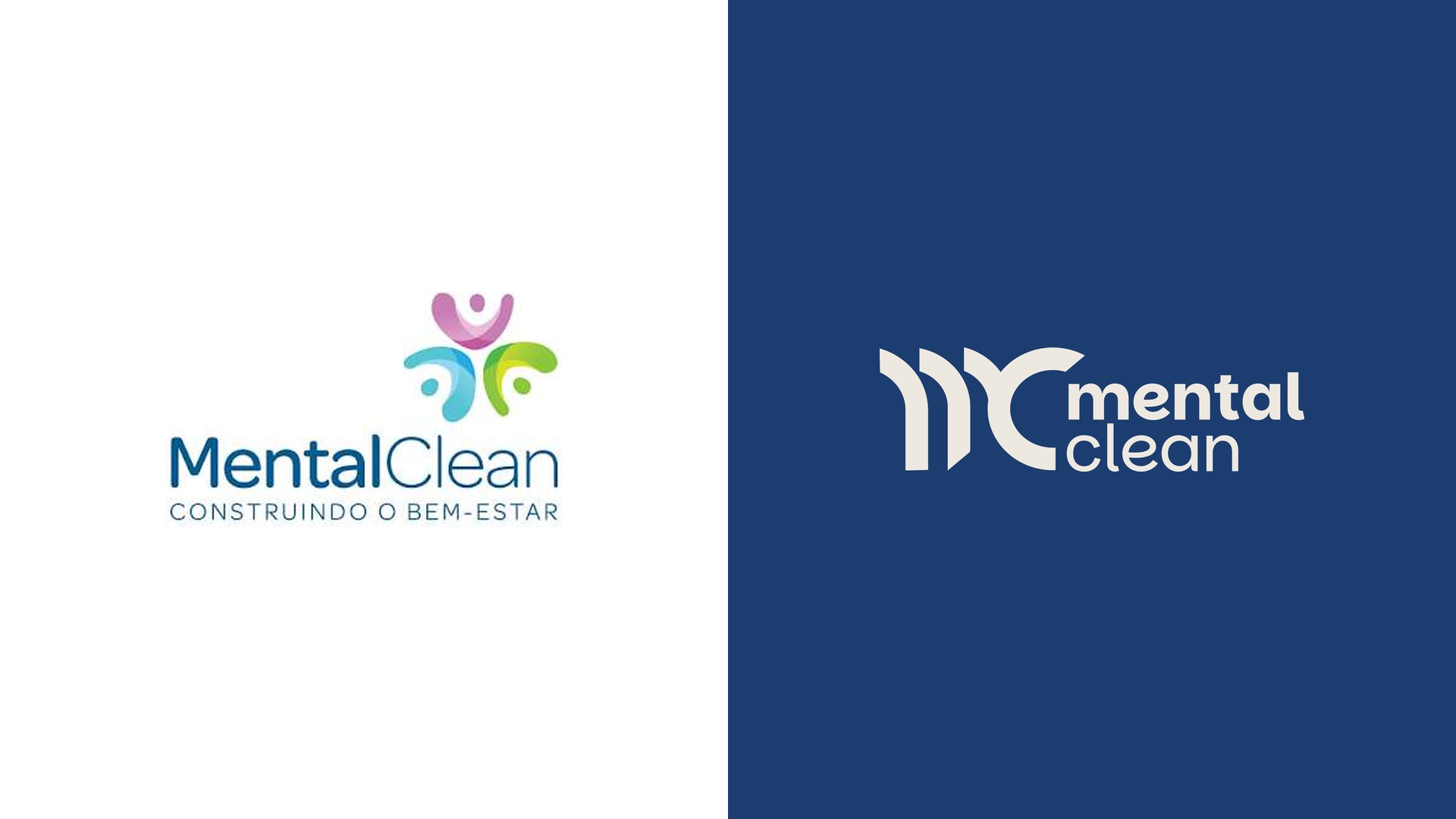
Inteligência emocional e tomada de decisão. O corte diagonal representa a virada: o momento em que pensar e sentir se integram ao agir. A transição entre o interno e o externo.
Emotional intelligence and decision-making. The diagonal cut stands for the turn: the moment when thinking and feeling come together in action. The passage between the inner and the outer.
Estrutura e presença interna. O que a pessoa acredita, o propósito que a move, a cultura que a sustenta. Reta porque é firme: não dobra sob pressão.
Structure and inner presence. What the person believes, the purpose that moves them, the culture that holds them. Straight because it is firm: it does not bend under pressure.
A curva lembra um corpo de braços abertos. Vitalidade, presença corporal, ergonomia. Não é acidente de design: é o ser humano reconhecível numa forma mínima.
The curve recalls a body with open arms. Vitality, physical presence, ergonomics. It is no design accident: it is the human being, recognisable in a minimal form.
Quando Corpo, Mente e Alma se integram, dois movimentos acontecem ao mesmo tempo: a qualidade de vida do funcionário se eleva e, como consequência direta, a produtividade da organização cresce. O corte não é decorativo. É a promessa da metodologia inscrita no símbolo. A direção é sempre para cima.
When Body, Mind and Soul come together, two movements happen at once: the employee's quality of life rises and, as a direct consequence, the organisation's productivity grows. The cut is not decorative. It is the promise of the methodology written into the symbol. The direction is always upward.
O que mudouWhat changed
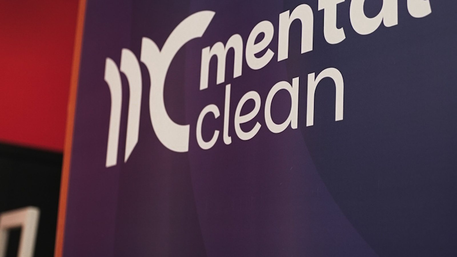
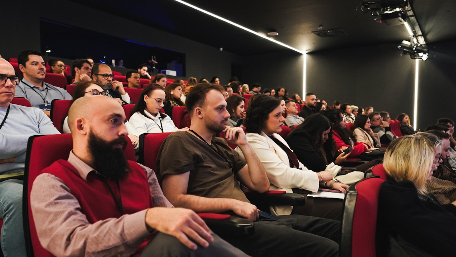
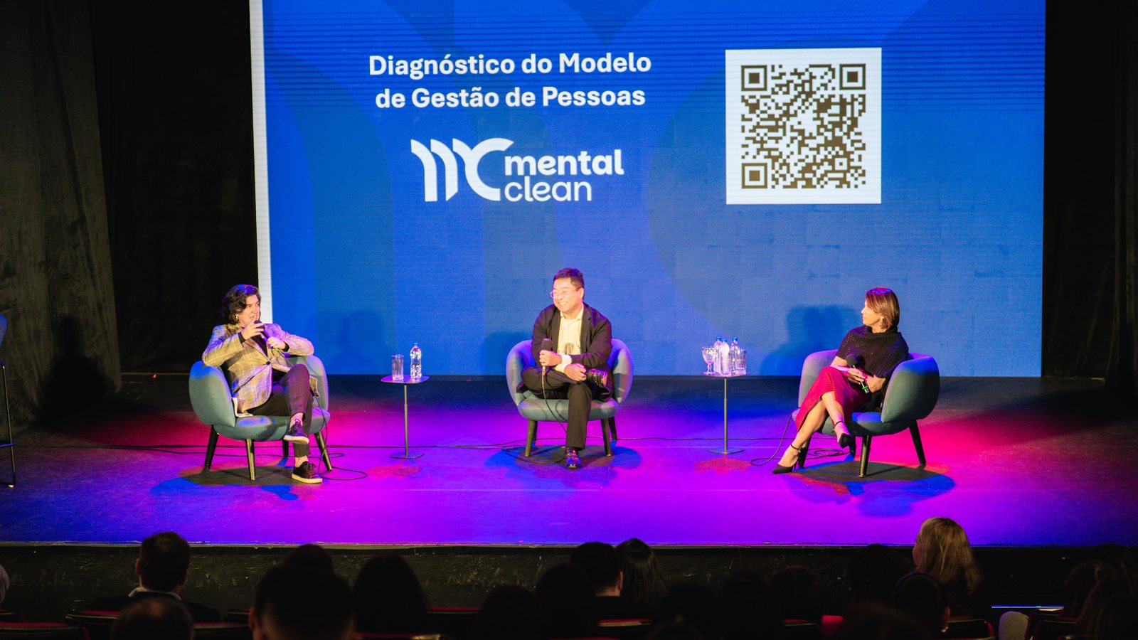
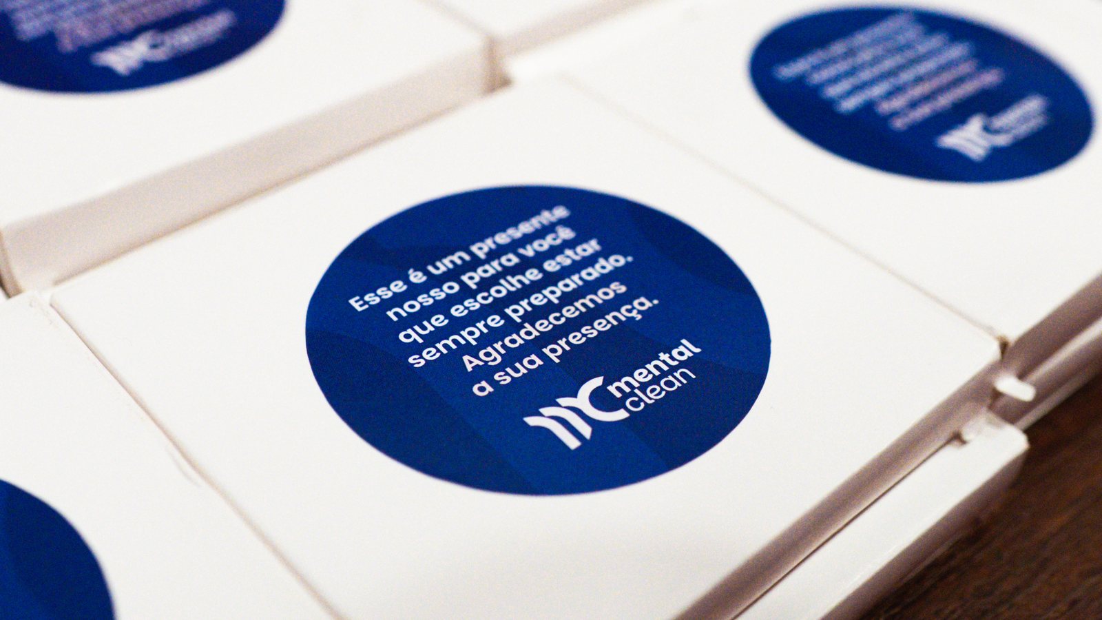
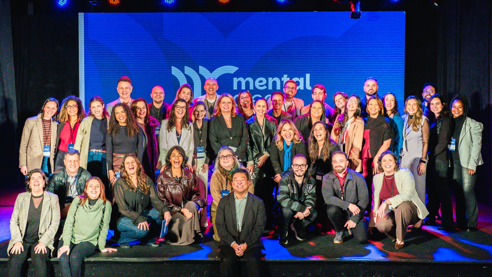
A marca nova foi apresentada primeiro às lideranças, no Encontro Semestral de Lideranças, e depois à empresa inteira. No LinkedIn, quem trabalha na Mental Clean e quem é do público dela reconheceu a empresa no desenho novo. No evento de lançamento para o mercado, em 17 de setembro de 2026, a marca nova ocupou o palco, os telões e as peças entregues ao público.The new brand was shown first to the leadership, at the half-yearly Leadership Meeting, and then to the whole company. On LinkedIn, people who work at Mental Clean and people from its audience recognised the company in the new design. At the market launch event, on 17 September 2026, the new brand filled the stage, the screens and the pieces handed to the audience.
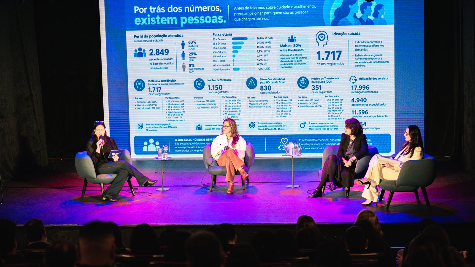
Fonte dos números: Mental Clean, brandguide 2026Source of the figures: Mental Clean, 2026 brand guide
ProvaProof
O que a CEO e as pessoas próximas da marca disseram.What the CEO and the people close to the brand said.
“É essa! Essa é a marca que traduz a empresa que nós já vivemos hoje!”Fatima Macedo · CEO, Mental Clean · LinkedIn
Ficou muito boa a nova marca. Projeto nota 10!Gabriel Eroico · Occupational safety engineerEngenheiro de Segurança do Trabalho
Moderno e com a mesma essência.Ercy A. Paschoal · Partnerships coordinator, TELUS HealthCoordenadora de parcerias, TELUS Health
Ficou muito linda a nova marca, mostra a trajetória e amadurecimento da Mental.Felícia Rodrigues · Project supervisor, Mental CleanSupervisora de projetos, Mental Clean
Ficou, como eu vejo a Mental Clean, ‘Pessoas no centro’.Rosa Paiva · People management consultancyConsultoria em gestão de pessoas
Feito com o The Strat Code™Made with The Strat Code™
A ideia central nasceu de uma decisão estratégica, fazer da tríade Corpo, Mente e Alma o desenho do símbolo, e foi levada a cada ponto da marca, do brandguide aos posts, apresentações e telões. É o The Strat Code™ na prática: primeiro a decisão, depois o desdobramento.The central idea came from a strategic decision, making the Body, Mind and Soul triad the drawing of the symbol, and was carried to every point of the brand, from the brand guide to posts, presentations and stage screens. This is The Strat Code™ in practice: first the decision, then the rollout.